One cannot deny the fact that the logos are a brand’s most valuable marketing assets. Companies like Amazon and Apple are great examples of how a good logo can take a brand to the next level. Taking inspiration from their success, brands today are more aware of logos and how it can help them to grow their business.

Just like the logo design, the logo color plays an equally important role in it. Logo colors are not just colors but a sensation that is transmitted to the brain whenever we see the logo of a brand, it creates an effect on our subconscious mind and especially on our psychological attitude towards the brand.
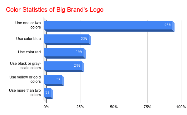
Big brands out there have decoded this a long back and are using colors wisely in their logos for a long time. Here’s a survey on how they use colors to make their logo appealing and rememberable for the audience.

Read: Best Image Compressor without Quality Loss | 250KB to 57KB
This graph shows how big established brands use colors most brands use only one or two colors in their logo. This is because, when you use more than two colors in a logo, you make it tough for your audience to comprehend and remember it. To know more about how color matters in logo design, you can read further.
Importance Of Colors In A Logo
1. Colors stimulate emotions
As a human, we have always associated colors with emotions like the blue color is for boys, pink is for girls, red is for danger and so on. Thus, the first reason why colors are important for a brand’s logo is that color evokes emotions.
Having the color scheme of your logo matching the emotions of your target audience shall greatly enhance your chance of making it big in your niche or industry. Different colors stimulate different emotions in a human being, here are a few examples of most used colors in a logo and emotions associated with them
Red Color
The red color is generally used to depict danger and hence it alerts our senses that there is some sort of urgency going on. Thus, most of the call to action buttons like Buy Now, Sale, Subscribe, etc are red in color, so that people can take quick actions which will increase the revenue of the brand. The red color is also associated with emotions like Confidence, youth, and power and hence used logos of big brands like LEGO, COCA-COLA, and NETFLIX.

Blue color
The blue color is more related to productivity and thus is one of the most used colors in offices. The blue color is also a synonym with peace and calmness. This color is mainly used in the logo to make your brand look more trustworthy so the audience feels safe to work with you.

Green Color
The green is a symbol of nature which also signifies growth and health. People in nature and the healthcare industry love to add green color to their brand’s logo. The green color in the logo also makes people feel safe while using the products of that particular brand. Starbucks, Tropicana, and Android are some brands that use green color in their logo.

Yellow color
The yellow color stimulates the emotions of happiness and optimism, apart from that it is a very warm and friendly color as well. Using yellow color in your logo will make people buy from you without any hesitation.

Black Color
The black color is one of the favorite colors of brands that make luxury items because it is a symbol of power and elegance. Top brands like Apple, Puma, and Adidas use black color perfectly in their logo to make them look one up with their competitors.

Similarly, there are other colors that generate different emotional values when we see them. However, the color choice of your logo shouldn’t be based on these common beliefs alone. Because, visual perception is quite subjective, so the color may depict different emotions to different people based on factors such as age, culture, gender, etc.
2. Color has a Psychological Impact
Colors have a huge impact on our psychology, intentionally or unintentionally we make a lot of decisions in our daily life that are influenced by colors. According to research, 60% of a decision to buy a service or product is based on colors.
This reason is enough for people who want to sell their products and generate a high ROI to strategically choose a color for their logo, which can influence the customers’ purchasing decisions.
3. Color foster brands identity
Visual memory is a long term memory, you may be already knowing that. So, if your logo color is good enough to make that first impact on your consumers’ minds, then they are going to remember it for a long time.
Also, over time they will begin to synonymies the color with your brand. Overall it’s a great thing for your brand’s identity…isn’t it? But for that to happen, make sure you choose the color of your brand very wisely.
How To Choose Right Color for Logo?
As we have discussed earlier in this article, colors are not just for a visual treat but they also have a great emotional and psychological message behind them. Thus, when choosing colors for your business make sure it conveys the right message of your brand to the consumers.
Also, if you have an online business then your logo color should match the color scheme of your website. If you have a mismatched logo then your website won’t look professional, and you may incur a loss in your business over time. You can use free online color picking tools like ImageLR to get color codes that will help you in matching colors online.
Conclusion
So that’s all about colors and why they matter for your brand’s logo. When creating a logo for your business choose a color more strategically so that you don’t regret your choice later. Also, keep things simple and do not try to fill all colors in the logo and make it look like a rainbow because that’s not going to help your brand either.


